Digital Media Review
October 7, 2026
Digital Media Review of City Witness and Medieval Swansea
City Witness Medieval Swansea was a website funded by the UK Arts and Humanities Research Council with research development created by an extensive team of professors and doctors. This website in particular was created for the purpose of sharing the history and importance of Medieval Swansea during the Middle Ages.
Additionally, due to bombings and redevelopment, much of the layout has been lost though interest and curiosity in Medieval Swansea has been increasing.
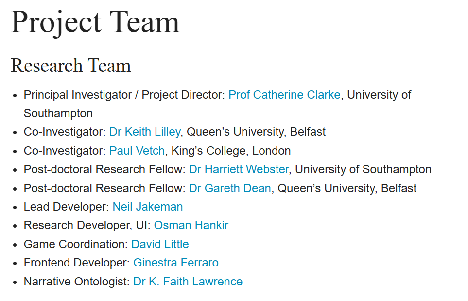
However, the goal of this project expressed in the “About” and “Project” section is to share a hybrid digital resource. This combination includes an interactive map of Swansea in 1300 which shows topographical and landscape elements. It also has an electronic edition of witness testimonies from the hanging of Welshman ‘William Cragh’ in 1300’s Swansea.
Users are encouraged to use this website to explore digitized primary sources and ask themselves questions about the topic of Swansea. Through many witness statements, the user should also leave with knowledge of the town’s different social and ethnic groups. It should also lead them to comparisons of said people and how they lived and their cultures.
The website creators also have desires to increase and contribute to South Wales local community and tourism. As well as bring more attention to the research and partnerships in this dire need of preserving history, in turn they hope to create more expertise, funding and additional resources for the project and Medieval Swansea in general.
The website is created with good intentions as well as with care when it comes to the information it displays. However, intention doesn’t always make a website inherently successful for a user. Aspects we must keep in mind are visuals, methods of information conveyance as well as ease of use or navigation of the website.
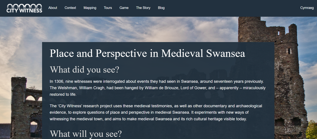
Let’s talk about the layout of the Medieval Swansea website and its logistics both aesthetically and practically.
The first thing a customer will notice is the scan ability and appearance of the document. Upon opening, the Medieval Swansea website is visually pleasing to the eye. It is clean with an interesting castle image underneath a short and sweet description of the research done as well as an establishing tone of the rest of the website’s content. The writing structure itself has nice headings larger than the description and the words are white, layered on top of a grey textbox.
The writing structure itself has nice headings larger than the description and the words are white, layered on top of a grey textbox. With the layering of colors in mind, the words are easy to see and read for those of regular sight and those of colorblind customers, as gray and white are seen normally to their eyes. They gray background and white text also passes the WebAIM color test. The castle image even has a small triangle mimicking an arrow at the bottom, leading the customer lower in the document.
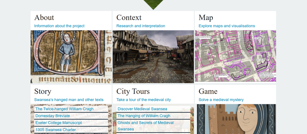
However, this aspect is simultaneously effective and ineffective. While the appearance of an arrow is useful, what the arrow leads to is not half as aesthetically pleasing or practical as the content above. While it leads to a navigation section, it feels highly disorganized with lots of images in a crowded space.
While there is some white space, I feel there needs to be more as well as better pacing for a user for ease of navigation. A user would rather see simple and spaced-out images or buttons with labels. Simplicity would make it easier for the customer to see the information without being overwhelmed by the sheer noise of the section.
The website also has a navigation section at the top of the website. While this can be useful for the user as they can choose what route to take, the congestion of the bottom images and navigation sections of the website is overwhelming rather than helpful. Instead, it would have been useful for the creator to utilize the top navigation menu and use a scroll method where each section is simply chosen by the website creator as to what information is most important to visit first. Creating both an option and a guided walk through helps both people looking for specific sections and a user who is simply curious about the topic.
Having two ways of navigation “sections” rather than a single page scroll and a menu section aesthetically feels overwhelming to both the appearance and the simplicity of the site. While the use of blue text was intelligent to signal possible links, it is highly overwhelming in such a small space with little breathing room.
Beyond the difficulties of the front page, the menu feels much more organized with a larger scale of white space. It has small images throughout all the sections, bringing life but still utilizing that needed simplicity. A specific part of the site that I find useful is the “In this section” side bar.
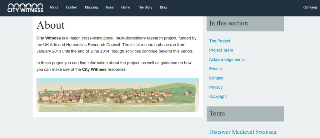
This keeps the website much cleaner with more clarity of thought when navigating. However, this section does not come without faults. There is no search bar throughout the website, which makes some simple navigating extremely difficult for a user if they are searching for something specific within the website. There are also so many tabs a user must explore, sometimes making the website feel similar to a corn maze with endless directions to travel down.
However, when you move into the actual content, tone and scan ability, something this site in particular uses that is beneficial is consistent bulleting of information and the separation of that information. This gives the reader information without creating an immediate overwhelm of historic information. Even if a reader chooses to skim the work, the bullet points and larger headings help to allow them to still find their way or in general get the gist of the writing.
Within some of these writing sections, there are images to aid the experience. This integration of physical media does keep the site informative as well as interesting. Without any imaging, these sections could be considered boring or unable to keep the focus of a reader. Especially one without a good attention span.
Specifically, the audience of this site are typically scholars wanting to learn more about the subject. However, we must keep in mind that they are not the only audience. Another audience aspect to focus on are tourists. For this reason, keeping it a little simpler and easily understood is key for the content of this site.
While some sentences within these sections are easy for a stranger to understand and bulleted for ease, some of the content sections don’t utilize this strategy and instead hold heavy blocks of paragraphs. While the information is important, there is once again, not enough white space in these areas. Meaning, that the conversation is too crowded for a reader. Especially those who find large boxes of text inaccessible.
One nice thing about this text area is that there are some images paired with them. The visualizations do keep a reader more engaged than they would without them. However, I still find the paragraphs slightly overwhelming. Especially to a tourist who just wants background information to ensure the tours are worth the money or time involved.
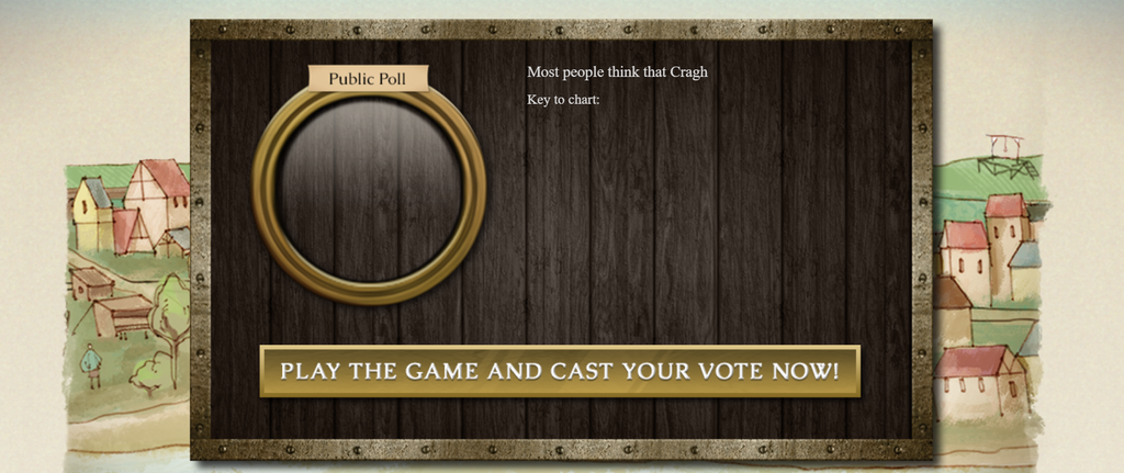
There is also a referenced “game” within the website that is supposed to be playable for a user. Yet, when the “button” is pressed, nothing happens, as if it never existed. I particularly found this section confusing and was unable to understand how it was used. It seems that the game itself is no longer open for users.
Within the website and menu areas, there are multiple ways to get to a single section. While on the surface this seems useful, it could make it extremely difficult for those who need to use keyboard methods for navigating due to blindness or difficulties with sight or other disabilities.
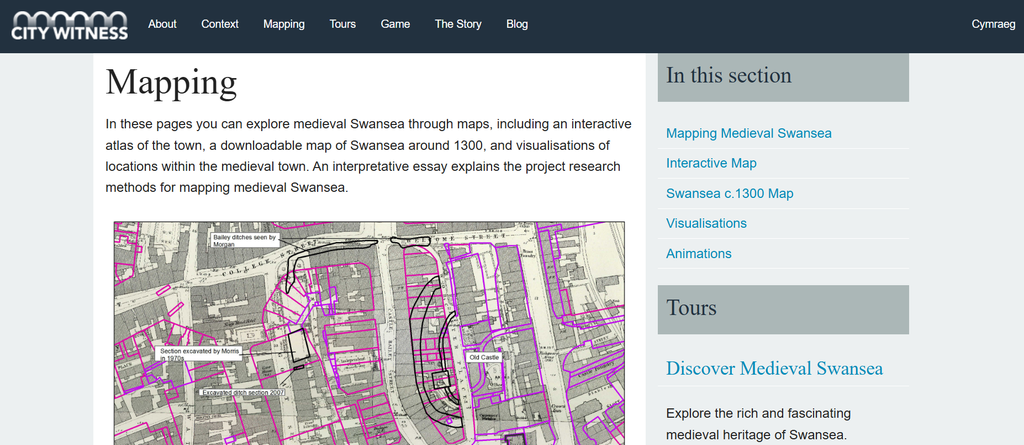
The Maps themselves are also useful, though there are so many within the website that it can also get confusing for those trying to find a place to visit. While the fact they are interactive is both useful and interesting, some of the map organization could be improved for a user’s ease.
With all of this in mind, I think this website has a lot of potential but still comes with its issues. If the website was adjusted and edited with these flaws in mind, it could be an extremely useful tool for both tourists and scholars.
BIBLIOGRAPHY
Medieval Swansea Website Mapping | City Witness
WebAIM Color Contrast Checker: https://webaim.org/resources/contrastchecker/
Accessibility Basics: Understanding the Web Content Accessibility Guidelines (WCAG). Accessibility Tips and Tricks. https://afb.org/aw/25/3/18626gad_source=1&gad_campaignid=22021023111&gbraid=0AAAAADnSdaqmbVPmaBEaXPK6FVMO7K1Hu&gclid=Cj0KCQjw5vLVBhCiARIsAD56SFJXwRvaBoX_VwWCsG5RdHRUYJKs_zEUA1H6rsmJlJgcmpyq9RM5ygIaAjWREALw_wcB.